


Latest
Mathematics Suggest That Fashion Is on a 20-Year Cycle
There’s a new reason to avoid cleaning out your closet


Latest Stories


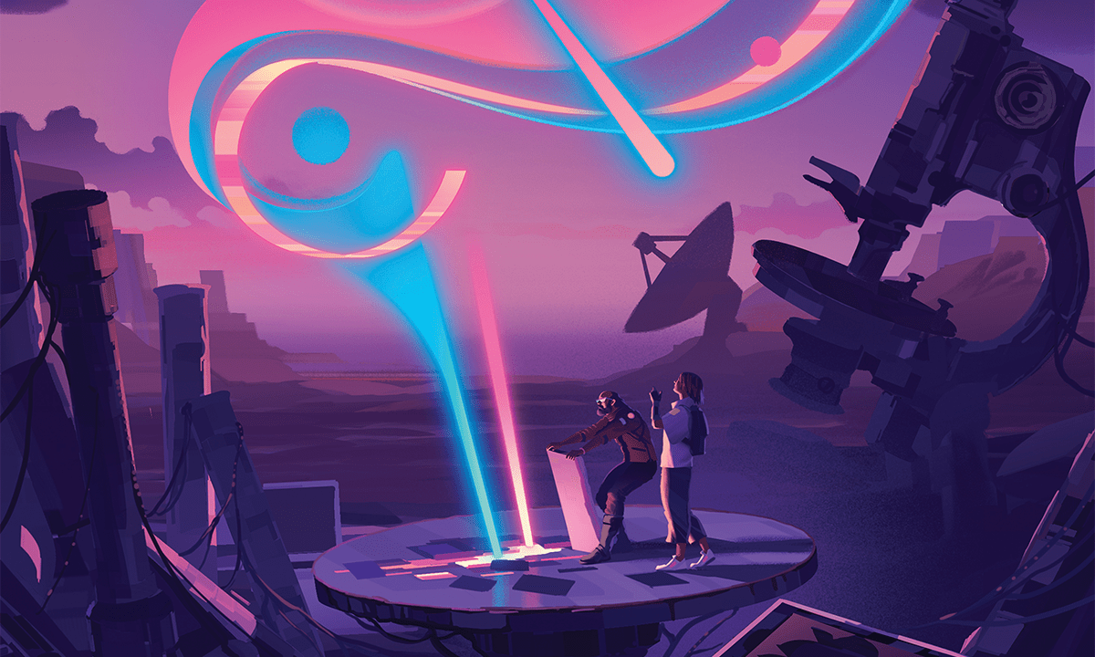
Welcome to the Block Universe
Where time is an illusion, reality just is, and you can see yourself as eternal

Psychology
See more PsychologyBabies Learn the Art of Deception Before Their First Birthday
Kids love to lie—almost right from the womb

What Doomsday Prophecies Say About Us
An interview with medieval studies scholar and apocalypse expert Matthew Gabriele

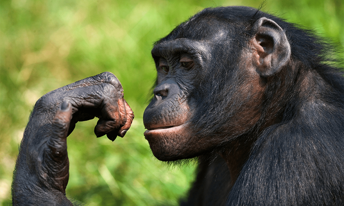
Humans Can Read the Expressions and Feelings of Our Primate Cousins
Just like our primate cousins can read human expressions
Environment
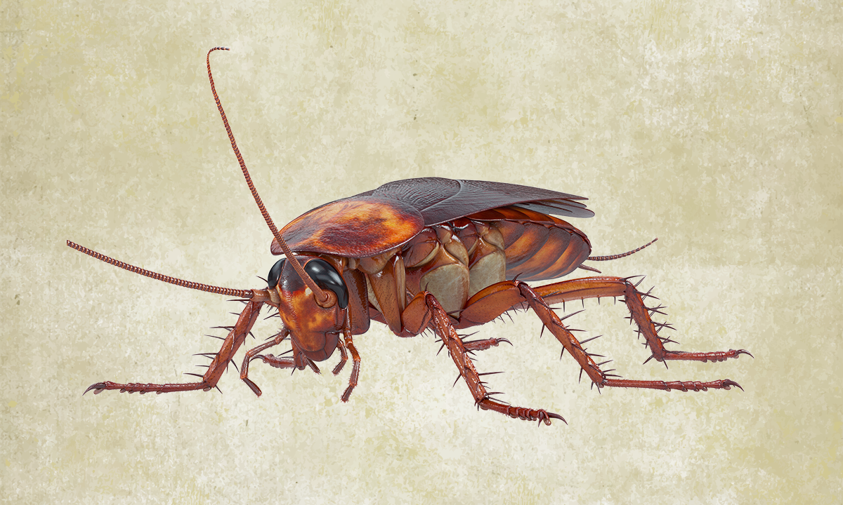
See more EnvironmentNewly Discovered Species Changes the Origin Story of Magic Mushrooms
There’s a new psychedelic mushroom in town

How Flowers Transformed Planet Earth
An interview with biologist David George Haskell about his new book

It’s Not Just You. Subways the World Over Are Feeling Hotter
Complaints of extreme heat are rising

Get unlimited, ad-free Nautilus. Become a member today.
History
See more HistoryHow Three Students Designed an Atomic Bomb
A top-secret 1960s project tasked physics postdocs with building The Bomb

The Thrill of Science in 2042
A science historian explains how science got its groove back. A fictional dispatch from the future.
How Energy Politics Played Out on the White House Roof
The quick removal of Jimmy Carter’s futuristic solar panels echoes more recent feuds over renewables

Physics
See more Physics
The Science Behind the Perfect 3-Point Shot
The difference between a satisfying swish and an embarrassing air ball

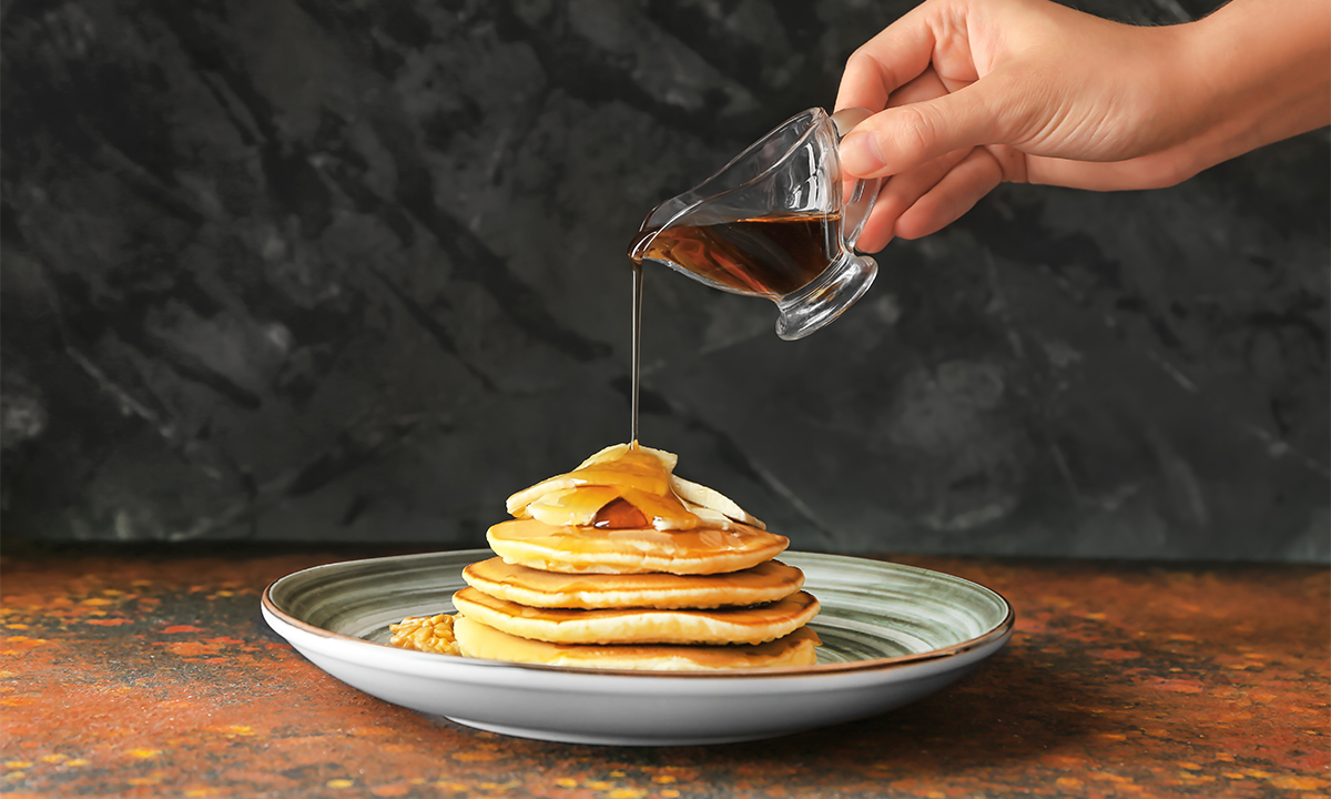
Physicists Uncover How Long It Takes to Get the Last Drop of Syrup
How to tackle a common kitchen problem with fluid dynamics
Communication
See more Communication
What Would Richard Feynman Make of AI Today?
The scientific sage was always suspicious of grand promises delivered before details were understood


Get the Nautilus newsletter
Cutting-edge science, unraveled by the brightest living thinkers.
Sociology
See more SociologyThe Vibes Have Been Off in the US for Decades
New survey analysis reveals a sense of national deterioration

Does Belief in God, not Political Party, Drive Conservatism?
Religious “nones” may be less socially liberal than they used to be

Parachute Science Continues to Prevail in Global South Biodiversity Studies
The privilege of describing new species is skewed to Global Northerners

Depression Linked to Energy Problems in the Brain and Body
It’s not all in your head

Read more
See all posts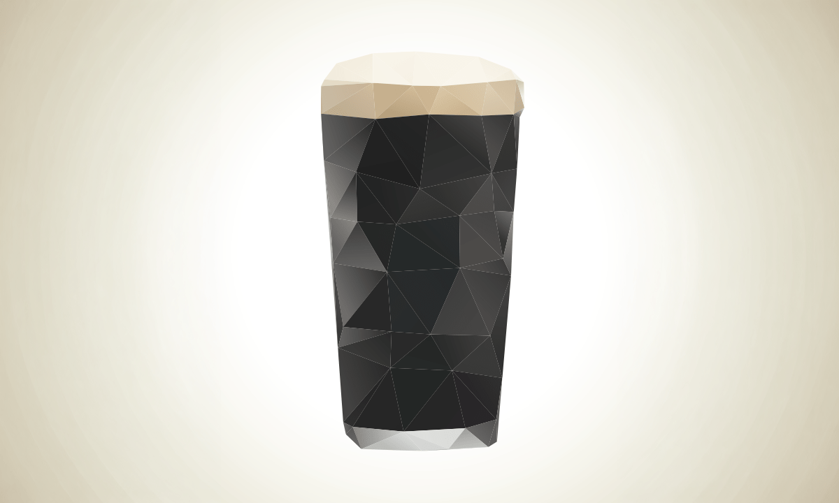

The Travels of Straight-Tusked Elephants in Europe, Written in Their Teeth
… and their travails as they encountered early humans

Money Can’t Buy You Youth
An off-Broadway drama shows what happens when billionaires take center stage in science

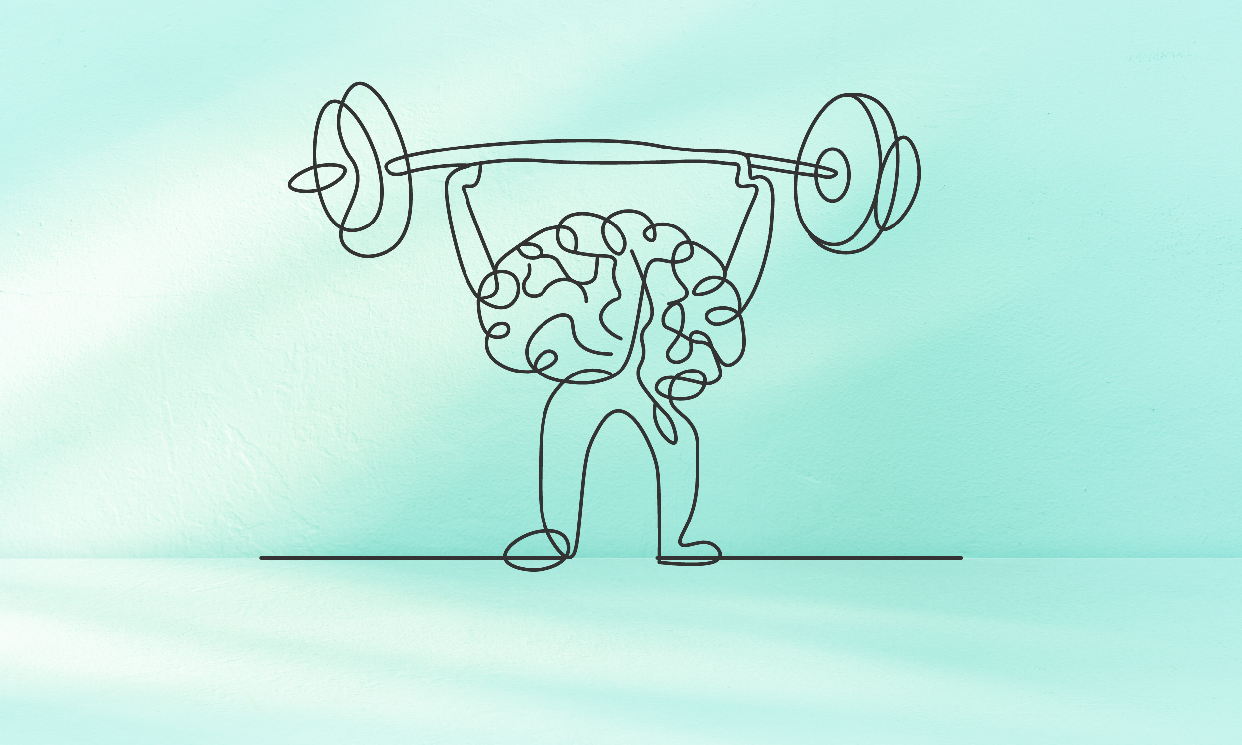
You Can Still Improve as You Age—With the Right Mindset
New research is challenging traditional assumptions of aging


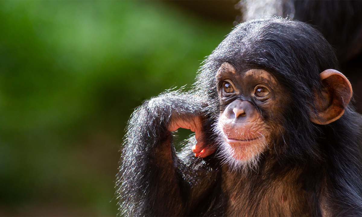
Bonobos May Not Be the Peaceful Apes We Imagined
They’re as aggressive as chimps, but with more female bullies