
You can wear them as high-fashion jewelry, eat them in marshmallow form, and wrap your packages in duct tape branded with their likeness. Their cultural currency is so strong that, in April, the color authority Pantone released a new color standard in their name—the first in three years. Who are they? Minions of course—those bright yellow, bespectacled, dungaree-clad characters from the Despicable Me franchise. Now they are the epitome of Minion Yellow—“the color of hope, joy, and optimism,” says Leatrice Eiseman, the executive director of the Pantone Color Institute.
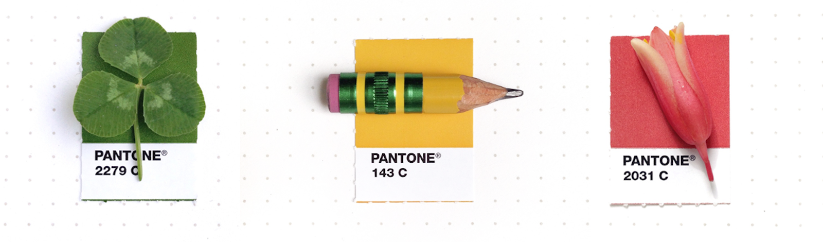
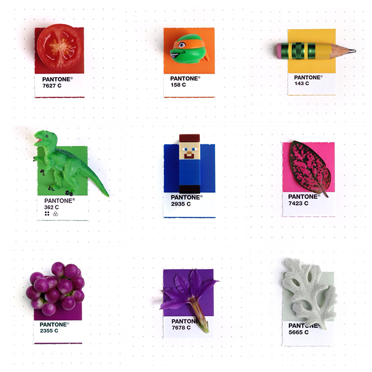
In the grand chromatic scheme of things, Minion Yellow is a drop in an ocean of hues. Since 1963, Pantone has created more than 10,000 standard color chips, which designers and manufacturers use to ensure the same products are consistently the same color, no matter where and how they’re made. Anyone can make a new color—by mixing pigments in different amounts, or by tweaking the finish, gloss, or texture of the material they’re printed on. But only after it is standardized and given a name does a color take on a true identity, Eiseman says.
A psychologist by training who has published nine books on color, Eiseman is a key influence in how we identify, and talk about, colors. For the past 15 years, she has gathered the world’s color experts in secret meetings held in an undisclosed capital city to choose Pantone’s “Color of the Year”—a single hue meant to represent the coming zeitgeist. She also puts together a range of seasonal palettes, forecasting the ever-changing colors of our clothes, our wall paints, or our office furniture.
I spoke with Eiseman about how she selects the hues that saturate our world. Fashion has been at the fore of color prediction since the 1920s, when Margaret Hayden Rorke, former head of the Textile Color Card Association (now The Color Association), scanned the Paris runways for emerging trends. But Eiseman is taking a new tack, looking beyond clothes to technology, food, and even animated creatures for inspiration.
Minions are the first animated characters to have their own Pantone color. Why aren’t there others?
You have to be cautious of cultural trends and meaning: They change; they are mutable. Some colors, like Chinese Red, will forever be seen in the cultural view. But today, even Chinese Red is not as pervasive as it was before. If you go to China now, people are wearing very westernized colors and clothes because that is what has currency now. When it comes to the world of entertainment, these trends change far more quickly. Several years ago, we were naming a purple, and Barney the dinosaur [from the children’s television show Barney & Friends] was very popular. Someone said, “Let’s name it Barney! It’s such a popular show, everyone will recognize it.” And I said, “I don’t know if you want to go there. What you need to consider is, 15 years from now, will people know what Barney Purple is?” If kids no longer watch Barney, that puts a “datedness” on the color.
So why did you go for Minion Yellow?
We see Minion Yellow as a long-lasting color because, when a film gets this much attention, we know that more sequels are in the works. More than likely, it will become a stage show that will travel the world over a protracted period of time.
Annually, Pantone declares a “Color of the Year” to reflect the coming zeitgeist. How do you select the final hue?
We start well in advance of the decision. We are all very well traveled. I travel every year to Asia, Europe, Canada—across the world—so that I can observe what captures the attention and imagination of people. One source of inspiration for us is the entertainment business, which has globalized. Another question we ask is: What are the hot colors coming up in food? Several years ago, pomegranates became an essential fruit because they were found to have lots of antioxidants. Of course pomegranate is a beautiful color to look at, and you saw several industries starting to adopt that color, particularly the glamour industry. We look everywhere for clues. Say there is a traveling art exhibit coming up. We ask: Is that artist known for a particular color? Another great source of inspiration are concept cars. These things can give you a clue as to what will happen in the future.
Pantone named “Marsala” as the color for 2015. How did you come up with that prediction?
This year we were looking for a robust kind of color, something that was fulfilling. “Marsala” is the color of wine. You also see it in food, and it is appetite stimulating. So there is the fulfilling connection to food and wine, but also the robustness and connectedness to more earthy tones. That quality seems to reflect what people are telling us they are looking for and what will make them feel more satisfied, more comfortable.
When you create a new color palette, how do you come up with the range of complementary shades?
The precept that you can always go back to is the color wheel. If you have had no education in color and you look to the color wheel at green, and opposite it you see red, then perhaps all you think of is Christmas colors. But as a colorist, you look beyond that. You look at the variations on red and green. Perhaps what you are looking for is a teal green rather than a brash red.
If I were doing a palette to reflect a certain mood, then I’d choose the colors that convey and support that mood. And then I’d look to bring in a surprise element. So say you have a palette of blues, greens, and turquoise. These are all usually very pleasing to people. They are analogous to one another on the color wheel, they don’t fight with each other, and their use in a room may be very comforting to you. But people will tire eventually of a prescribed color scheme. So instead of the same realm of analogous colors, you want to go with something that is perhaps a little shocking, like a hot pink. It is still complementary; it’s on the other side of the color wheel, the red-green association is there. But it is a little different, a little surprising.
How do you name colors?
Colors are named when they are created. Looking at the Pantone system in particular, it is the international language of color. We use those names we feel are most evocative. If you pull a lipstick out and you see it is lipstick number 1234, that is not very romantic. We try to evoke an emotion. Mood Indigo. Hawaiian Ocean. Blue Atoll. These are evocative. You think of a tropical sea, of being on vacation, of a natural beauty. They capture the imagination, and this gives each color its own romance.
How do you predict how people will react to a color?
Word association studies are extremely helpful. You take a Pantone color chip and you ask, “Give us the first word that pops into your mind when you look at this color.” And you see whether that corresponds to a positive, negative, or indifferent response. If you show people a chip of Pantone Sky Blue, about 90 percent or more will respond in the same way: It’s the color of the sky, it’s bright, it’s a light color, it reminds you of that openness. It’s a near-universal response that you get.
Do people’s responses to color ever surprise you?
A great example is the color brown. Years ago, in word association tests, when we showed people different browns they would invariably say “it is dirty,” “it is soiled,” “it is unpleasant.” But then came what I like to call the Starbucks Phenomenon. Suddenly brown evokes some exotic coffee drink many of us are committed to on a daily basis.
How has people’s use of color changed over time?
If you look at the early ’80s, there was a distinct pattern of mauves, grays, and teals. But in the mid-80s, there was a greater range. I attribute this to women becoming more vocal about the choices they wanted to see, and not being beholden to one look or one mood. One of most exciting things for me in last 20 years is the shift toward holding on to what we have. We think in terms of how to mix and match rather than throwing something away and then starting from scratch. There is more room for creativity.
What I love is that people have become increasingly experimental; they are not abiding by what were once thought of as the fundamental rules of color. The idea that you must not use such and such a combination, this rigid interpretation of color matches—that is fading now. More and more, designers, and even just people in their day-to-day lives, are using color in a more original way. That’s why technology is such an exciting area. In five years we might be able to make a new paint that changes color depending on time of day or season. These things fascinate people. We are all in our psyches still little children. Give children a box of crayons, and with innate abandon they start to scribble. There is an innate joy in expressing with color. Even if we are not aware of it, we remain fascinated with color.
Claire Cameron is the social media and news editor at Nautilus. You can follow her on Twitter @clarabell8
All photography by Inka Mathew.