

Many common air pollutants—ozone, various sulfur oxides, and even some particulate matter among them—are completely invisible to the eye. How interesting, then, that the EPA and other environmental organizations around the world, use color scales to communicate information about air quality.
The US Air Quality Index, for instance, starts at green, meaning good air quality, moves through yellow and red, then ends at maroon, to mean hazardous air quality. That’s quite straightforward in concept. But if you’re walking along a narrow urban street full of idling cars at rush hour, or passing through an industrial corridor when a tower suddenly lets off ominous clouds of exhaust, an orange AQI warning from the day before may not reflect your local circumstances—the specific mass of air you pull in through your nose, deep into your lungs.
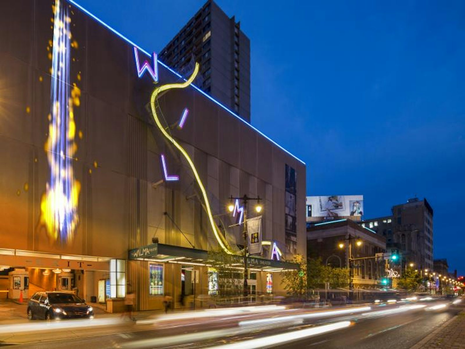
Andrea Polli is a digital media artist and professor of art and ecology at the University of New Mexico who is inspired by these types of systems to find better ways to illustrate the environmental threats we face. Her large outdoor installation piece, Particle Falls, which most recently hugged the Wilma Theater facade in downtown Philadelphia, can show, in real time, the level of particulate matter in the air.
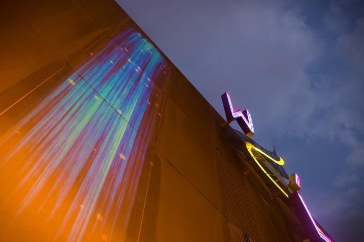
As part of Sensing Change, a larger art and science exhibit focused on climate change, Particle Falls offers a glimpse into the ether. It features a large projection of a waterfall of blue that is updated every 15 seconds according to readings from a nearby sensor called a nephelometer. The nephelometer detects fine particulates in the air (defined as particles smaller than 2.5 micrometers, or one-ten-thousandths of an inch). Particles smaller than 10 micrometers, and especially the finer ones, can pass into the nose and throat, posing potential health risks. The particulate detected by the Particle Falls nephelometer comes from a variety of combustion sources, including diesel exhaust, factories, and even cigarettes.
A custom computer program converts these readings into golden bursts within the waterfall. The number of bursts increases and ebbs in proportion to the shifts in particulate matter floating in the surrounding air. When a bus idles in front of the theater, for instance, the frequency of the pops intensifies.“To me, one of the more interesting issues is how impactful visualization can be for people,” said Polli in a recent interview. “What’s strong about the information is that people can get the differences between levels. When a bus stops, you can really see a dramatic reaction versus when there’s nothing there.”
The American Lung Association’s State of the Air website gives Philadelphia’s particle pollution a D. In 2012 the surrounding region’s air was rated as the 10th most polluted in the US. Yet these statistics mean a lot less than literally seeing the vast number of invisible pollutants light up a large-scale screen. When the piece was first installed, Polli says it got a big reaction from the crowd. People had a hard time believing there was so much particulate matter in the air.
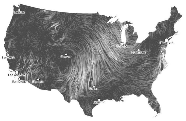
Other artists are also working to meaningfully show otherwise invisible environmental data. Wind Map, another part of the Sensing Change exhibit, is a living portrait of wind speed and direction across the United States. Created by computational designer Fernanda Viégas and computer scientist and artist Martin Wattenberg, its striking visualization is based on data from National Digital Forecast Database and is updated every hour. Viégas and Wattenberg say they are pushing the boundaries of how to use new forms of data visualization in their collaborative work, including their co-leadership of Google’s Big Picture data visualization group.
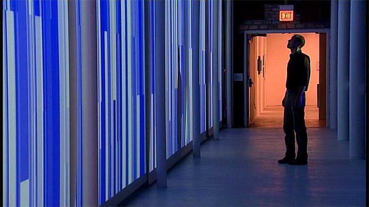
Inigo Manglano-Ovalle is another artist working to illuminate climatic issues. His piece Random Sky, installed at Chicago’s Hyde Park Art Center, used 10 indoor projection screens to display the data output of a weather transmitter. The wall visually interpreted the city’s temperature, barometric pressure, and wind speed and direction.
To accurately depict real atmospheric data, Polli works collaboratively with a diverse group of scientists and technologists. “For an artist, looking for new innovation, materials and technique, cross-disciplinary collaboration is useful. The kind of art I do is concerned with the environment and sustainability and I’ve become focused on the hard problems that we have to solve. You can’t do that in isolation,” she says.
After a fortuitous meeting in 2004 with Cynthia Rosenzweig, who heads the Climate Impacts Group at the NASA Goddard Institute for Space Studies, Polli turned her focus toward climate change. “She started saying things that were really shocking. She was saying things such as, ‘Climate change is the biggest catastrophe of mankind,’ and this was at a time when this was just starting to break,” says Polli. “Scientists of her stature aren’t going to say this without justification.”
Heather Sparks explores art and science at Science Sparks Art. She studied molecular genetics at The Ohio State University, has a graduate degree in science journalism from New York University, and currently lives in Brooklyn.