The cause of aviation safety has had a terrible week. An Air Algérie flight crashed yesterday in Mali, reportedly killing all 116 on board. The day before, a TransAsia plane went down on the Taiwanese island of Penghu, leading to the deaths of at least 48 people. And, most notoriously, Malaysian Airlines Flight 17 was apparently shot down in the conflict zone in eastern Ukraine, killing 298 people. Experiences like these challenge us to keep a clearheaded understanding there is always a risk when we fly, but that it’s generally extremely low.
To help lower that risk still further, every time you get on the plane, you’re instructed how to fasten your seatbelt, to put on your oxygen mask, and to inflate your life vest. One of the last things you hear before taking to the skies is something like “You will find and all other safety information in the card located in the seat pocket in front of you.“ So do you actually study the card? What you’ll find is a not just a list of safety facts, but an unusual piece of media, designed to effectively convey information and instill a sense of potential urgency, while leaving the passenger free to calmly enjoy—or at least ride out—the much more likely possibility of an utterly average flight.
Below are some different approaches to designing airline safety cards, from a variety of airlines over the years. To figure out what works—and what doesn’t—we enlisted the help of Rami Moghadam , the art director at Conde Nast Traveler and a collector of safety cards himself. (The images all come, with permission, from Kevin Cleynhens.)
Ansett B737
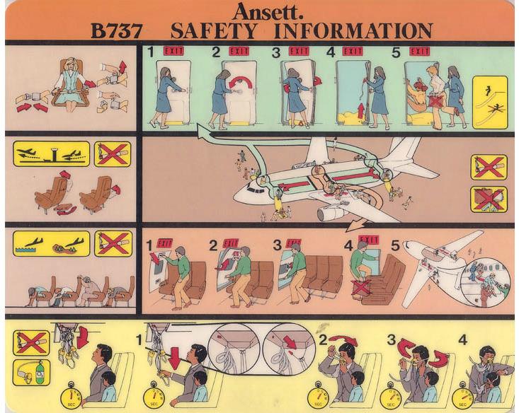
Moghadam: The first thing I notice on this card is the color scheme. The designer(s) of the card divided the content into different boxes and applied various color backgrounds to differentiate them from one another. While this works in theory, to me this is a bit confusing, as some of the color choices are very similar to one another and almost seem to blend the content together.
While there is use of numbers and arrows, the overall flatness of the design (the majority of elements are the same size) makes it tough to quickly and effectively get information from this piece. I almost wish this card had some basic text to walk me through the illustrations I’m looking at. Some of the illustrations seem a bit busy, with perhaps a bit too much detail. While usually detail is great, in this case it can become a problem, as you want the reader of the card to extract information as quickly as possible.
Finally, notice that the designer(s) opted for a horizontal layout. To me, this is a bit counterintuitive, as you place items into the aircraft’s seat pocket vertically (magazines, etc.)—so why have the reader take the extra step of turning this piece around in order to read it?
Nautilus: Studies have shown that color can trip passengers up when viewing safety cards. In one study, for example, a card that illustrated the safety lights along the aisle of the cabin illuminating was difficult for respondents to understand. The researchers suggested that it can be hard to tell whether a color is a design choice, or contains meaning.
Austrian Airlines DC-9
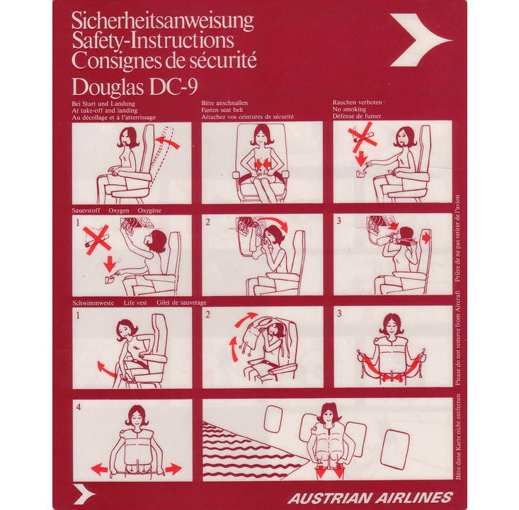
Moghadam: This card is very clear due to its simple organization, which is to be expected from an Austrian airline (or Swiss, or German airline, for that matter). Starting from the top left, you have a headline (translated in three languages, neatly stacked) to tell you what you’re looking at. Switching over to the top right, Austrian Airlines’ bold mark quickly and effectively brands the safety card. Notice the absence of a variety of colors; the designer(s) focused on a simplistic dark red, bright red, and white color scheme. The bright red functions as an identifier for directionals—arrows that help guide you through the illustrations—which visually pops and cleverly demands your attention.
The modular grid system enables the placement of several equally sized white boxes, which allows for simple and clear organization of the content and fast reading through the various steps. Notice the restraint used when displaying numbers in the boxes, in each top-left corner. While the numbers are small and subtle, the fact that they are consistently placed on this modular grid makes them stand out, because your eye is trained to look in the same spot on every box to find the number.
To stay within the minimalist design scheme, the illustrations are pared down and only show what’s of utmost importance. No fancy backgrounds and environmental scenes here—strictly the chair, the passenger, and the seat. Overall this is a very successful design in my opinion.
Nautilus: Minimal designs can be good, but some surveys suggest that passengers prefer a little more. In a survey by the Australian Transportation Safety Bureau, researchers found that overly simplistic illustrations can reduce effectiveness of safety cards. If the passengers see the person on their safety cards as a cartoon, rather than a person, they seem less likely to understand or remember the instructions.
Medallion Air MD-80
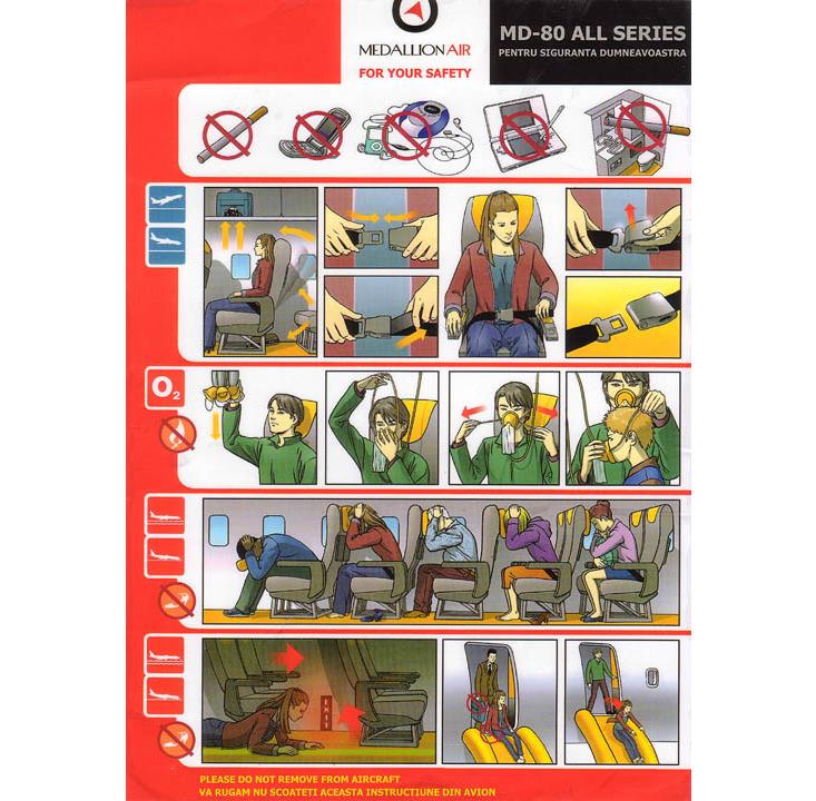
Moghadam: For a card that relies exclusively on illustrations to convey information, this is a very successful design. Instead of words, icons are used at the beginning of each row to signal procedures during takeoff vs. landing (plane pointing up vs down). Other icons help to explain what not to do; look at the shoe icon, telling you not to wear heels!
Looking through the neatly grouped sets of illustrations, I am able to quickly get the information I need, which is what matters most. But while the illustrations are simple, one could make the argument that the use of shading and heavy/muted colors almost make them a bit too busy and slightly tough to read.
Nautilus: It might seem like a text-free design is the way to go, but studies suggest that without text, passengers can misinterpret the instructions. In one study, passengers preferred cards that integrated words and pictures, rather than one or the other.
Livingston Energy A321
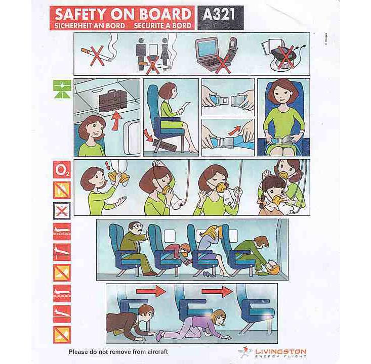
Moghadam: While the illustrations in this piece get the point across, to me the choice of illustration style seems a bit out of place. The danger with choosing a more cartoony illustration style is that a reader could interpret the piece as something lighthearted, not to be taken too seriously. The bright, poppy color palette (especially that ‘happy’ lime green) also adds to the vibe of a Sunday morning children’s program.
Nautilus: Surveys suggest that passengers do want their safety cards to remind them that safety is at hand. In the Australian Transportation Safety Bureau survey (pdf), one respondant explained that they liked a card in part because “[the] yellow or red indicates to me its safety.” Passengers also didn’t like it when the airplane depicted in the safety card didn’t look safe or robust. “The safety/exit door—it looked like it was convoluted,” complained one respondent.
China Eastern A340-300
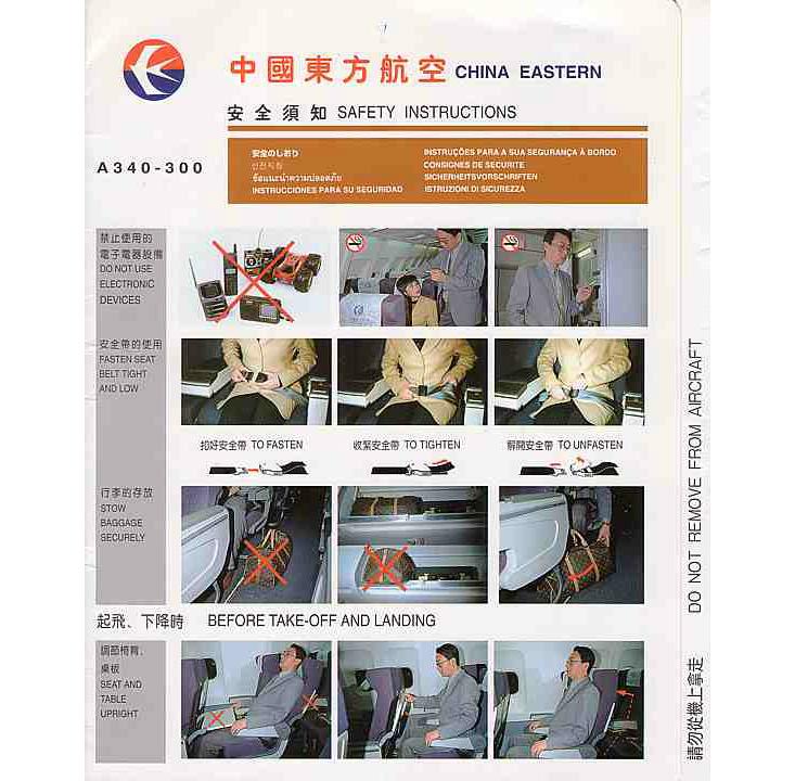
Moghadam: This is one of only a few examples of safety cards I’ve come across that opt for photography over illustration to visualize the procedures. It’s a shame that the photos don’t come off as professionally shot - you get the sense that an untrained photographer used a point-and-shoot camera with flash. Compositionally, the photos aren’t as great as they could be and more attention should have been paid to clearly describe these procedures visually.
Nautilus: In most studies, cards featuring photographs are rated as less effective and desirable than those that use pictures or words.
Today some safety cards and live demonstrations from the crew are giving way to more modern approaches, like the funny safety videos that Delta is now using. But the videos don’t cover everything, and the safety card is still a part of aviation safety. Unfortunately, almost 70 percent of passengers never look at the cards. Perhaps the next time you fly, you can take some time to critique the design of the safety card—and become just a smidgen safer while reading its content.
Rose Eveleth is Nautilus’ special media manager.