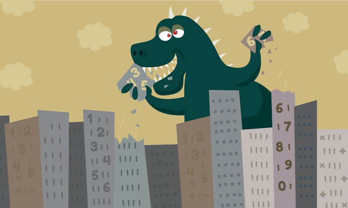

A chart’s purpose is usually to help you properly interpret data. But sometimes, it does just the opposite. In the right (or wrong) hands, bar graphs and pie charts can become powerful agents of deception, tricking you into inferring trends that don’t exist, mistaking less for more, and missing alarming facts. The best measure of a chart’s honesty is the amount of time it takes to interpret it, says Massachusetts Institute of Technology perceptual scientist Ruth Rosenholtz: “A bad chart requires more cognitive processes and more reasoning about what you’ve seen.”
It helps to know the kinds of tricks that charts can try to pull. Here are five.
Puzzling Perspective
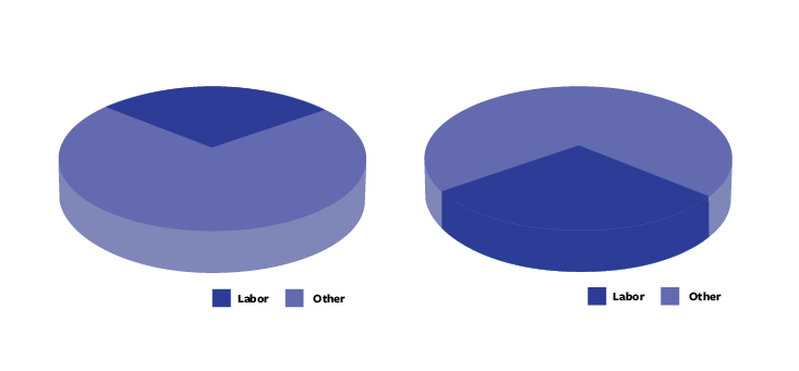
Both of these pie charts show “labor” taking up 30 percent of some total. But you probably noticed that the chart on the right makes the labor slice look a lot bigger by positioning it in the foreground, which gives it a thick 3D edge and more than double the number of dark blue pixels than when it’s in the background.
Human vision isn’t very good at interpreting the third dimension, says Rosenholtz. When confronted with a 3D chart, we assume that more color indicates a greater amount. So when more pixels are used to represent one slice of a pie chart, the slice appears more significant, Rosenholtz says. That’s why we can assign a greater value to foreground slices in 3D pie charts.
Swindling Shapes
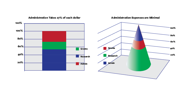
A classic way to lie with a chart is to introduce irrelevant information. In the chart on the right, the only relevant property is cone height. But, while the cone volume is irrelevant, it is also very difficult to ignore, encouraging us to assign a greater value to the larger part of the cone.
In both charts, administrative costs take almost a third of each dollar. While this matches reasonably with the left chart, the right chart seems to shrink administrative costs to something much less than a third. “Anytime you ask anyone to judge just height and ignore the other measurements,” says Rosenholtz, “it’s going to take extra cognitive load to disregard these other cues.”
Trendsetters Are Tricksters
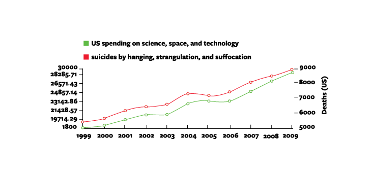
When two or more lines appear together in a chart, and they look similar to each other, we have the tendency to assume they are related. The red line in this chart represents suicide rates while the green line represents spending on science and technology—two completely independent sets of data. But on first glance, we tend to ask ourselves whether there could, in fact, be a causal correlation (if you can think of one, tell us in the comments section below).
We like trends because they tell a story that make data more meaningful, Rosenholtz says—that’s why we’re always on the lookout for connections, even when they don’t exist.
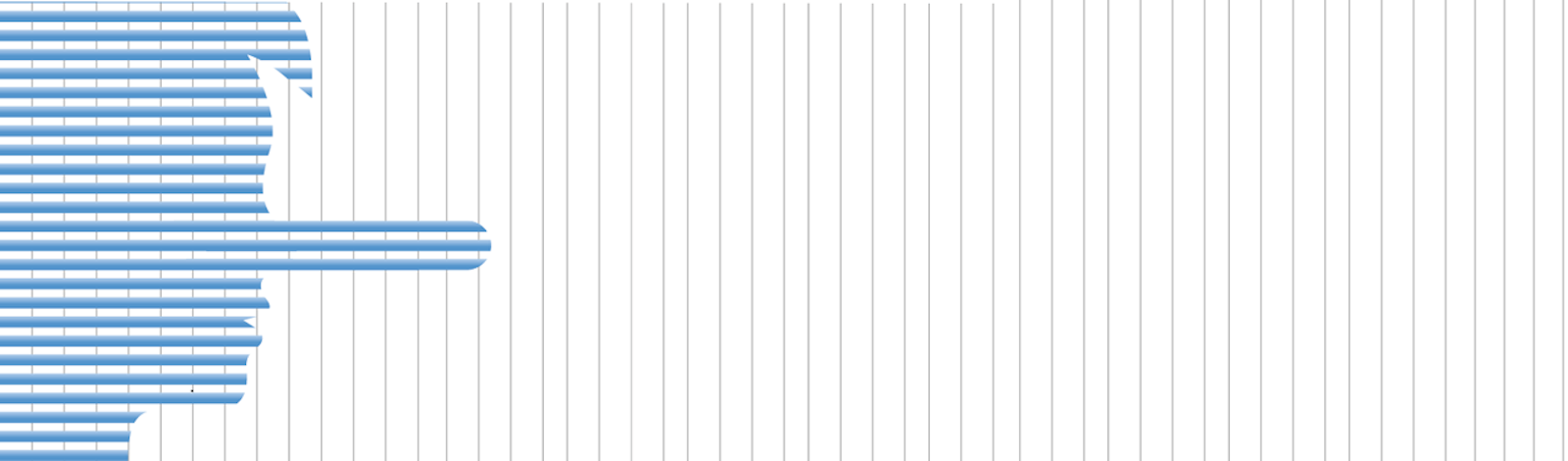
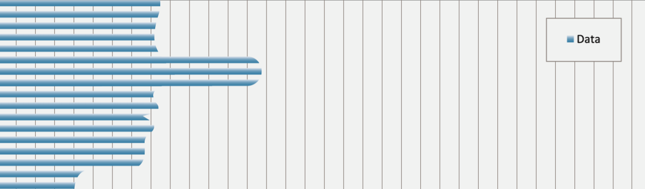
Hiding in Plain Sight
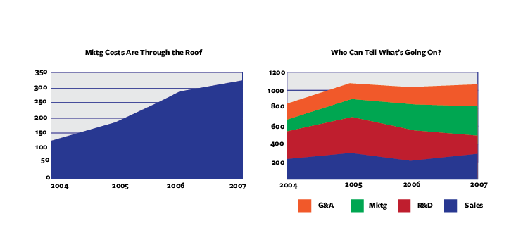
We’re pretty good at noticing trends. But what if there’s one that someone doesn’t want us to see? The left chart clearly shows that marketing costs have tripled over three years. This same fact is there in the right chart, but it’s hidden among a host of other data, softening the impact of the sharp incline in marketing costs, and making that incline nearly impossible to quantify.
“Comparing the change in height between data sets while they also move up and down is not a natural visual task for us,” says Rosenholtz. “It’s not clear to me whether I’m supposed to be looking at the overall height or the width or what. Any kind of comparison like that is more cognitive and less effortlessly visual.”
Honey, I Shrunk the Scale!
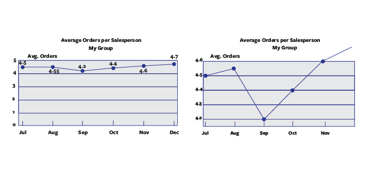
At first glance these two charts seem to depict two different data sets. But home in and you’ll see that the only difference is scale.
This trick works because it’s difficult for us to examine a chart’s scale and data at the same time, says Rosenholtz. Instead, we often get the gist of the curve first, then (if we decide we need to) look at the scale. By that point, though, our first impression has already been made.