


Suddenly, black was everywhere. It caked the flesh of miners and ironworkers; it streaked the walls and windows of industrial towns; it thickened the smoky air above. Proprietors donned black clothing to indicate their status and respectability. New black dyes and pigments created in factories and chemical laboratories entered painters’ studios, enabling a new expression for the new themes of the industrial age: factory work and revolt, technology and warfare, urbanity and pollution, and a rejection of the old status quo. A new class of citizen, later to be dubbed the “proletariat,” began to appear in illustrations under darkened smokestacks. The industrial revolution had found its color.
Black is technically an absence: the visual experience of a lack of light. A perfect black dye absorbs all of the light that impinges on it, leaving nothing behind. This ideal is remarkably difficult to manufacture. The industrialization of the 18th and 19th centuries made it easier, providing chemists and paint-makers with a growing palette of black—and altering the subjects that the color would come to represent. “These things are intimately connected,” says science writer Philip Ball, author of Bright Earth: The Invention of Color. The reinvention of black, in other words, went far beyond the color.
Bideford black is an extraordinary material,” says Onya McCausland, a doctoral candidate in fine art at University College London. She is talking about a black pigment found in the Carboniferous formation that runs from Wales to Devon in England. Mined from the 18th to the 20th centuries, it was considered one of the best coal-based black pigments available. “Its texture is soft and velvety,” McCausland says. “It produces a very dense, bluish-black. If I want the black to be really immersive and dense, I’d use Bideford black.”
Bideford black was one of many carbon-based black pigments used from the 16th through the 19th centuries in Europe. Charcoal was the inexpensive mainstay, though it produced a gritty paint that was difficult to apply. Bone black (ground from burnt bones) gave a warm brownish black, while lamp black (burnt vegetable oils) and vine black (charred grapevines or other vegetable products) gave cooler shades. Black derived from ground ivory was perhaps the richest of the lot.
This dark arsenal of dyes supported an evolving but particular set of subjects and themes. For centuries, black was a color of death and evil. The Egyptian jackal-headed god Anubis, who guided souls to the afterlife, almost always appeared as a black figure, his skin matching the blackened flesh of mummified bodies. When the devil began to appear in European art, in the 11th century, he too was usually a nightmarish black.
Black also developed a second identity around this time representing the asceticism favored by monks, as noted by the French historian Michel Pastoureau. By the 15th century, black garb had become a fixture of regal courts in Europe, connoting power and privilege. Soon after, the growing middle class also adopted black garments to represent their growing wealth, as well as their piety.
Seeking to reflect the wealth around them, 16th- and 17th-century artists used this broad palette of blacks to distinguish the different tones and textures of their sitters’ sumptuous clothes. “In the late Middle Ages, black became the color of distinction,” says Ball.
The arrival of the industrial revolution in the 18th century sparked advances in mining technology that boosted the output of coal-based pigments including Bideford black, while simultaneously driving up demand. Bideford black was ideal for polishing up the cast iron stoves that swept into kitchens during the period, for example, and it also fuelled local lime kilns.
Black, which seemed to obscure and remove color and life, invited a new inner life.
Coal could also be baked in hot, airless ovens to drive off water and gasses to make coke, a high-carbon fuel useful for cooking, heating, and smelting ores. By the early 19th century, the purified coal-gas generated in this process—containing hydrogen and hydrocarbons—was being burned to light factories and streets. And when chemists began to investigate the sticky black waste left behind after coking or gasification, they found a rich source of organic molecules that would come to overshadow coal itself as a direct source of pigment.
In the 1840s, August Hofmann extracted aniline (a benzene ring connected to a nitrogen-containing amine group) from coal tar. Then in 1856, William Perkin, a student of Hofmann’s, oxidized aniline to create a deep purple dye, subsequently called mauve. This marked the birth of a completely new industry: synthetic dyes. By 1860, other researchers had found that oxidizing aniline under different conditions, using sulfuric acid and potassium dichromate, created a new black pigment: aniline black. The reaction fuses together 11 aniline molecules to make a complex chain of benzene rings connected by nitrogen atoms. Mixed in paint or ink, it produces a neutral, matte black also known as Pigment Black 1.
This compound—and many other synthetic organic blacks—would be produced on an enormous scale for printing and dying cloth. They also opened up new possibilities for black ink, which had traditionally been made with lamp black or iron gall. Soluble synthetic organic dyes were much more versatile, and could be mixed with different solvents to create just the right consistency of ink for applications as diverse as ballpoint pens, felt-tip pens, and spray paints.
Around the middle of the century, paint-makers began to offer a synthetic inorganic black pigment known as Mars black. It was made by reacting iron sulfate with an alkali such as lime or caustic soda—all chemicals that were in widespread use at the time— to make iron oxide. Mars black had a much smaller particle size than its natural equivalent. This made it handle well on the brush, and gave better coverage on the canvas. And it had a greater tinting strength than even ivory black, making it probably the most opaque black available at the time.
Mars black also dried much faster than carbon blacks. That is because linseed oil, the favored medium in oil painting, dries not by losing water, but through a series of chemical transformations. Its fatty acids react with oxygen from the air and then join together to form polymers. In most colored oil paints, metal salts in the pigments catalyzed this reaction. Sometimes drying agents, such as lead white, were added to speed up the process. But that was not possible with black, as it would wash out the dark hue—and since most black pigments were made of carbon, rather than metal salts, that meant that the black areas of oil paintings dried slowly and unevenly. The result is that blacks are often the most cracked areas of old paintings.
Spanish surrealist Salvador Dali used Mars black, and said of Jacques Blockx, who developed one of the earliest commercial Mars black oil paints, “This man, who never painted, will contribute more to the painters of tomorrow than what we will have accomplished, all the modern painters together.”
In the 20th century, a flood of new black paints would inspire a new set of artistic styles that took on modern subjects and themes. “Black was increasingly connected with industry, technology, and the urban environment,” says Erma Hermens, who leads the Technical Art History Group at the University of Glasgow. “Black becomes a statement.” Black also helped artists to delineate a new period in the history of art. “It was saying that the time of classical painting was past,” says Ball, “that we’re using modern materials in a modern way.”
The starting pistol for this movement was Black Square by Polish-Russian artist Kazimir Malevich, first exhibited in 1915. A very early example of abstract painting, it is simply a square of canvas covered in black paint. Malevich called his style “Suprematist.” Relying on simple shapes and a limited palette, it marked an absolute rejection of the depiction of objects in favor of pure expression. Tellingly, the painting was mounted high in the corner of the room, where Russian Orthodox icons would traditionally have been placed—a rejection of religion in favor of the secular. “It symbolized the collapse of traditional values and social structure,” says Belgian artist Frederik De Wilde—processes that had been hastened by the industrial revolution and its creation of new socioeconomic classes.
Malevich grew up in Tsarist Russia, and trained in a series of art schools in Kiev and Moscow. In 1913 he designed the set and costumes for Victory over the Sun, an avant-garde opera that saw “futurist strongmen” rip the sun from the sky, ending its decadent reign and freeing the future from time itself.
These themes—decrying the status quo, and looking ahead to a new world—were common in the Russian avant-garde of the time, and they fed into the growing demands for societal change that resulted in the Russian revolutions of 1917. Malevich would join the People’s Commissariat for Enlightenment in 1918, but by the 1930s his work had been labeled anti-Soviet and degenerate. After he died in 1935, his coffin was adorned with a black square.
Malevich’s work inspired abstract artists such as Robert Motherwell, Ad Reinhardt, Jackson Pollock, and Mark Rothko, who all made heavy use of black in their work. Whereas Malevich used a spectrum of carbon blacks in his paintings, from ivory black to lamp black, his successors wanted to reflect the rapid technological changes in society through the materials they used, and went looking for new black paints. As Pollock said in 1951: “It seems to me that the modern painter cannot express his age, the airplane, the atom bomb, the radio, in the old forms of the Renaissance or any other past culture. Each age finds its own technique.”
Black opens up a mental field all of its own.
Pollock repurposed enamel paints that were intended for painting cars or interior decorating for his art. Developed in the 1930s, enamel paints typically used synthetic iron oxide or mass-produced carbon black pigments suspended in polyesters known as alkyds, which readily cross-polymerize in air and dry to a hard, glossy finish. They gave Pollock’s “drip paintings” a sheen that emphasized their explosive power, and a durability that continues to please conservators. His liberation from the materials of the past was echoed by the physical freedom he enjoyed while creating his paintings, striding around canvases laid on the floor like a sculptor working around a lump of stone. He rarely planned what his paintings would represent—instead, it was an act of instinctual expression. The results evoke moods that range from joy to chaos.
In the early 1950s Pollock created a series of works that relied almost entirely on black, often pouring globs of thick enamel paint onto the canvas. The paintings were a reaction against his earlier, more colorful abstracts. Seemingly stung by some critics’ claims that these earlier pictures were merely decorative, Pollock set out to produce determinedly difficult works: This would disabuse “the kids who think it’s simple to splash a Pollock out,” he explained in a 1951 letter.
This stance was shared by Ad Reinhardt, who produced a series of all-black paintings that were first exhibited in 1963. One, called Abstract Painting, is a huge black square composed of nine smaller squares, each of subtly different blacks: The squares at the corners have a red tinge, while the others have a hint of blue or green. Reinhardt described it as “a free, unmanipulated, unmanipulatable, useless, unmarketable, irreducible, unphotographable, unreproducible, inexplicable icon.”
Pollock’s and Reinhardt’s rejection of the usual literal forms of representational painting was, in a sense, strengthened by the rejection of color itself. Black enabled a pure abstraction, and amplified the turning away from the aesthetic values of the Renaissance and Enlightenment that had been displaced by the same industrial technologies creating the new pigments of the modern era.
The displacement of literal representation opened room for a new meaning of the color: negation, contemplation, and spirituality. In the words of the French artist Pierre Soulages, black “opens up a mental field all of its own.” He began his epic journey into blackness in 1947, when he started creating abstract expressionist works using a dark walnut stain to make bold slashes across canvas. By the 1950s he was working in oils, thickly smeared onto surfaces using a palette knife. And in 1979, he began a new series of works in a style he dubbed “Outrenoir”—roughly translated as “beyond black”—with canvases completely saturated in black.
Transcendence and negation also inspired the American painter Mark Rothko, who produced a series of black paintings in the 1960s. For Rothko, the negation of color and light represented “doorways to the unknown,” and invited spiritual contemplation. In the words of the Tate Gallery, the paintings introduce “an element of duration and physical self-awareness into the process of perception.” Black, which seems to obscure and remove color and life, invited a new inner life. Some of Rothko’s black paintings were commissioned for a Catholic church in Houston, today known as the Rothko Chapel, making their spiritual dimension explicit.
The new industrial black pigments had another attractive feature that was altogether more prosaic: They were cheap. This was a key factor for abstract artists who wanted to cover large canvases. Industrial quantities of mass-produced paint let them work on an industrial scale. “They painted as though they were painting industrial structures,” says Ball.
Motherwell, for example, painted more than 100 paintings in his series Elegies to the Spanish Republic, many of which measured more than 9 feet across. Featuring large black ovals on a pale background, he called the series a “funeral song” inspired by the Spanish Civil War. This war was, itself, a conflict only conceivable in the industrial age, taking the lives of 700,000 people in three years and sparking the first-ever air-raid bombings of civilians. For Motherwell, the contrast between the dark ovals (rendered in black acrylic paints, which blended pigment with polymers of acrylic esters) and their background represented a contrast between life and death, while the ovals were reminiscent of the testicles of dead bulls displayed after a bullfight.
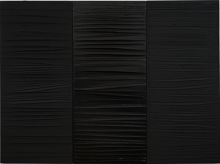
To describe NanoBlck-Sqr #1 as a black square seems not only obvious, but a gross understatement. Created by De Wilde, this meter-wide artwork is an all-encompassing void of utter black. As Spinal Tap’s lead guitarist Nigel Tufnel once said: “It’s like, how much more black could this be? The answer is none. None more black.”
The surface of NanoBlck-Sqr #1 is coated with a forest of carbon nanotubes that trap more than 99.99 percent of the light that falls on them. Exhibited in London earlier this year, its complete lack of discernable features produces a sense of limitless depth—viewers have an urge to reach right into the space it creates. “It’s like a visible black hole—that’s a very powerful effect,” says Narayan Khandekar, the director of the Straus Center for Conservation and Technical Studies at the Harvard Art Museums in Massachusetts.
The artwork continues the intersection of science and aesthetics that has so characterized the history of the color black. As an art student, De Wilde was frustrated by the lack of innovation in painting and sculpture. He believed that using the most advanced materials in his art would offer a way to represent science and innovation’s broader influence on society. De Wilde cites the French artist Yves Klein as a key inspiration. In 1955, Klein collaborated with a Parisian chemical manufacturer to create a new shade of blue—similar to ultramarine—dubbed International Klein Blue. The secret was not to invent a novel pigment, but to combine it with a polyvinyl acetate resin that gave full reign to the pigment’s intense color.
In the mid-2000s, De Wilde realized that he might be able to control the behavior of reflected light by tailoring pigments at the nanoscale. So he started searching for scientific collaborators. “If you look at the history of nanotechnology, you arrive at Rice University in Texas,” says De Wilde. Rice was home to Robert Curl and Richard Smalley, who shared the 1996 Nobel Prize in Chemistry with Harold Kroto of the University of Sussex for their discovery of nano-sized spherical shells of carbon atoms (C60).
In 2010, De Wilde began collaborating with chemist Pulickel Ajayan at Rice, and soon produced Hostage pt.1, a black square not much bigger than a postage stamp that was billed as the blackest painting ever made.
“With my black squares, I’m anticipating the creation of a new society,” says De Wilde. “It’s very related to the artworks of Malevich.” But while De Wilde may have been inspired by Malevich, his techniques were beyond anything available during Malevich’s time: He made his blacks by manipulating light on scales smaller than a single wavelength.
De Wilde created the work by first sputtering charged iron ions onto a silicon wafer. When the wafer was transferred to a chemical vapor deposition furnace, the iron acted as a catalyst that helped to knit together carbon atoms from a feedstock of acetylene gas into nanotubes. “It’s a very delicate process, and it doesn’t work every time,” says De Wilde. “But when it does, you can see the material literally growing like a black forest.”
De Wilde went on to apply a carbon nanotube-based optical coating technology developed at NASA to cover a set of 3-D printed titanium structures. The result is a series of objects collectively called M1Ne II, which look like futuristic birds’ nests about 20 centimeters across. The structures hearken back to the birth of the industrial revolution by reflecting data about seven coal mines around Limburg in Belgium. This data includes the depths of the shafts, the amount of air pumped into them, the energy produced by their coal, and the relative locations of the mines. “In part it symbolizes the cohesion of the coal miners—they had to rely on each other to survive,” says De Wilde.
The series neatly connects the various identities and histories of the color. But it also reflects a basic desire of the artist, says De Wilde: “Creating the blackest black is a reaction born out of necessity.”
Mark Peplow is a science journalist based in Cambridge, U.K.
Lead artwork is by Frederik de Wilde: NanoBlck-Sqr # 1 (2014)/Carroll/Fletcher and the artist. CarrollFletcher.com. Photo by Robin Reeve.