
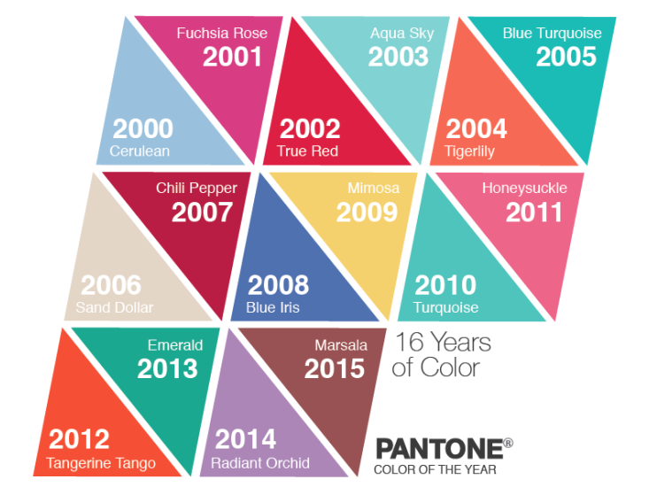
In each of the past 16 Decembers, Pantone has announced a “color of the year.” The company, famous for its system for standardizing colors around the world, has chosen hues as different as vibrant Fuschia Rose (2001) and understated Sand Dollar (2006) to encapsulate the visual and psychic spirit they believe will prevail during the coming year. Seldom do successive years share similar shades. But back in 2004, the orange Tigerlily provided a fulcrum between two relatively close blue tones: 2003’s pale Aqua Sky and 2005’s bolder Blue Turquoise. The warm orange was meant to evoke hipness and a hint of something exotic. But seen together on the color charts, the oscillation of aqua/orange/aqua calls to mind the iconic colors of the old Howard Johnson’s roadside restaurants.
The colorists at Pantone might blush at that retro connection, but it’s indicative of the incredible power color holds in branding—a big part of the reason that Pantone’s annual selections are so significant. Leatrise Eiseman, the executive director of the Pantone Color Institute, explained that the selection committee pays attention to “concept cars, the entertainment industry, the fashion industry, [and the] food and beverage industry” in order to discern “what colors are ascending.” They weigh those trends in relation to the “’zeitgeist’ of the public and socio/economic conditions” to determine the main color of the year and other, more seasonal colors that will also trend high. (See Nautilus’ full interview with Eiseman, in which she discusses the thinking behind the color of 2015, how the use of colors in fashion is changing, and the first cartoon characters to be honored with their own Pantone color.)
I asked Eiseman if I could attend the meetings for 2016’s color selection but she demurred, saying folks outside the industry are not permitted to participate. That rule didn’t stop author Tom Vanderbilt, who was invited to a Pantone meeting in 2012 but told to pretend he worked for the company that owns Pantone, so the presence of a journalist wouldn’t put the attendees on guard. While he was there, Eiseman told him that color forecasting “suffers from two misconceptions. The first is that there is some kind of ‘evil cabal’ that ‘schemes to get the colors out there.’ The second is [that the forecasters say] ‘let’s just throw a dart and wherever it lands is what’s going to be the hot color for next year.’”
I don’t know whether color forecasting involves cabals (as I didn’t get into the meeting), but I can say the darts are unnecessary. For whether they are conscious of it or not, the committee follows some patterns when making their choices.
The most readily apparent pattern is that some similar colors recur eight years apart—as is the case with the two true blues, Cerulean (2000) and Blue Iris (2008), and the two oranges, Tigerlily (2004) and Tangerine Tango (2012). Picking related colors recur eight years apart is a pattern that’s especially useful to marketers of goods that get replaced on a long timeline, like cars and furniture. So when Pantone chose Marsala, a hearty wine-brown, as the 2015 color, I was not surprised. While it wasn’t inevitable that the committee would choose this color specifically, it was likely they’d choose a color containing a significant amount of black, because so far, the only other color that had much black in it was Chili Pepper, the 2007 selection. Chili Pepper seemed due for a counterpart this year, and that dark richness was the likely trait to reiterate.
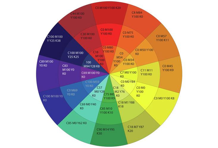
Before describing the other major pattern, a visit to the color wheel and a quick review of some color theory are in order. Pantone colors are created using an extended set of colors, but it’s possible to approximate most of the hues using the CMYK color system that photographers and digital printers employ. CMYK stands for Cyan, Magenta, Yellow, and Black (the K actually comes from “Key”); these are the colors that are blended, in varying proportions, to create the myriad colors we see on the majority of printed material. To indicate how much of each color is needed, printers designate the quantity using an increasing scale from 0 to 100. As you can see on this color wheel, a true yellow (the middle color in the wedge of yellows) is just that—all yellow, with no cyan, magenta, or black. Thus, its CMYK value is 0 0 100 0. But very few colors are made up of one component; instead, they are combinations of C, M, Y, and K. This wheel offers a sampling of those colors: The “hues” are in the middle ring; “tints,” which are lighter variants of the hues, are in the inner wheel; and “shades,” or darker variants of the hues, are in the outer ring. If you were to locate most of the Pantone Colors of the Year on a color wheel, you’d see what I mentioned earlier: very few would be near the outer edge because very few include a substantial K component.
In addition to the colors clustering toward the middle of the wheel, we can find another pattern at work, one that connects the color selections of successive years. Plotting the colors on a color wheel reveals that the choices careen at fairly predictable angles, like pinballs bouncing across the playfield, unless something profound—like 9/11—tilts the table.
Even though the color wheel above presents only a small fraction of all the possible colors, it can help us get a sense of how the annual colors relate to their antecedents. Let’s start with a simple case, that of the “Howard Johnson’s colors” mentioned earlier. The CMYK value for Aqua Sky (2003) is 52 1 24 0. On the chart above, you can see that the pale aqua wedge has a CMYK value of 57 0 28 0, which is quite close to the particular aqua Pantone chose. Its simple color complement—that is, the color across the wheel—is an orange with the value 0 54 100 0. So if Pantone wanted a simple complement for Aqua Sky, they needed to look no further than that part of the wheel. And, indeed, Tigerlily (2004) has a value of 7 78 82 1, which is in that neighborhood. It’s a little further away from the center of the circle than Aqua Sky is, but that makes it a perfect set-up for 2005’s Blue Turquoise, which has a CMYK value of 68 6 35 0. Blue Turquoise is very close to the middle part of the aqua wedge on this example wheel, which has a value of 69 0 40 0.
Looking at the CMYK values of the aqua and orange on the color wheel above, which can serve as approximations of Aqua Sky and Tigerlily, we can get a better sense of how those colors are created. They incorporate opposite amounts of C and M. Whereas Aqua Sky required a lot of Cyan (57 points), Tigerily needs none. And analogously, Tigerlily requires a lot of Magenta (54 points), but Aqua Sky needs none. Their C and M values are the inverse of each other. Between the true yellow I mentioned previously and its blue complement, one sees the same pattern: Yellow had 0 for both C and M, blue has 100 for each. And the light purple and its yellowy complement similarly vary, with the proportions of Magenta and Yellow flipped in that case. Creating complementary colors often involves altering two out of the first three elements (C, M, and Y) in this predictable way.
But neither Pantone nor the public really wants an eternal oscillation between a few complementary colors, which is likely why a different pattern emerged in 2006. For the last decade, most of the selections have been in a triangulated relationship to one another, with the colors turning around the wheel in successively wider circles. This enables the committee to select harmoniously related colors without falling into a repetitive back-and-forth loop. Such triangulation explains a color like subdued Sand Dollar, which was chosen in part because it “expresses concern about the economy.”
Sand Dollar, which came right after the aqua/orange/aqua era, looks anomalous. But it actually shares much with its two predecessors. Above, I noted that simple complements are generated by inverting some of the component color quantities. But if we change one of the component color values by the amount that would be required to create the simple complement, but not the other(s), we are able to create companion colors that reside somewhere else on the color wheel, rather than straight across from our original color. And that’s exactly what happened in 2006. Sand Dollar (12 16 23 0) has a Cyan value that is 56 points lower than that of Blue Turquoise (68 6 35 0), which is what we’d expect of a complementary color. But its M and Y values are pretty close to those of Blue Turquoise. So instead of being over near Tigerlily, Sand Dollar is on an angle from both its precursors. Together, the three points would form a tight triangle.
To be sure, there are a lot of colors in the general range of Sand Dollar, and it wasn’t inevitable that the colorists would chose that particular tone. The exact choice involves not only triangulating of the component color values, but also the judgment of the committee members. Nevertheless, the pattern of such modulating recurs frequently among the annual choices, suggesting a way that the entirety of the color spectrum gets reduced to a general range from which the ultimate choice will be made. To my mind, that’s a great relief, as it ensures that between successive years, we’ll be working with colors that are congenial together. We won’t have to buy entirely new wardrobes, but can instead punch them up by incorporating the ascending, trending tone.
These two patterns—of eight-year cycles and of selecting colors that triangulate around the color wheel rather than jumping directly across it—offer enough predictive power that I’ve used them to make two conjectures for what the 2016 color of the year might be—one for a hope-filled 2016 and one for a more somber year. I’m betting on Peacock Blue (16-4278 as a Pantone tone) if trends suggest 2016 will be an upbeat year. If the winds are less positive, I’ll be going with Porpoise (15-3800). Come December, we’ll get to see how good my predictions are.
Margot Anne Kelley is a photographer and writer whose work focuses on art and the environment. Her latest book is A Field Guide to Other People’s Trees.