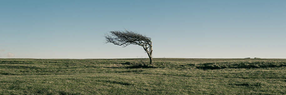
The paths wind weaves through the world remain largely invisible to us. And it’s proved challenging to track on a large scale over history. But I recently happened upon this entrancing model of the world’s winds, set in motion.
Courtesy of a network of NOAA-operated satellites and careful data work, this comprehensive picture—spun out over hours and days—lends some order to the seemingly chaotic movements of the air around the globe. (Watch the animated winds gust here.)
To get this wild and windy picture of our planet at any given moment, NOAA scientists use various types of imagery the satellites collect—from visible light to infrared light bouncing off of water vapor in the air. The result is a layered portrait of the air and its many paths.
The yellow shapes display the trajectories of winds we ourselves might have felt at surface level (up to about 10,000 feet). The cyan denotes midlevel winds where a single-engine aircraft might fly—some 10,000 to 23,000 feet. And the red is the realm of the jet stream and commercial flight, up to about 46,000 feet.
Tracking wind patterns isn’t only useful for plotting out aviation routes. It also impacts everything from wildfire and smoke risk to patterns of precipitation and the paths of catastrophic storms. And scientists and sailors alike have noticed that winds—and the storms that ride in on them—seem to be getting harder to predict.
For now, I’ll be gazing at the dazzling display of this data, as it sweeps across land, sea, and sky—and looking for its traces outside the window, too. 
Lead image: Pishko LenSi / Shutterstock