Felice Frankel lives between the lines. Along with being a part-time science photographer, she’s a researcher at the Center for Materials Science and Engineering at the Massachusetts Institute of Technology.
“As a photographer,” Frankel says, “I look for edges.” Her previous career, as a photographer of architecture, taught her how to capture the most striking elements of a design. “But here’s the thing,” she says. “Edges don’t really exist. If you really, really get down to things, what looks like a clean separation from one place to another, when you investigate it microscopically or macroscopically, is not as perfect as it appears.”

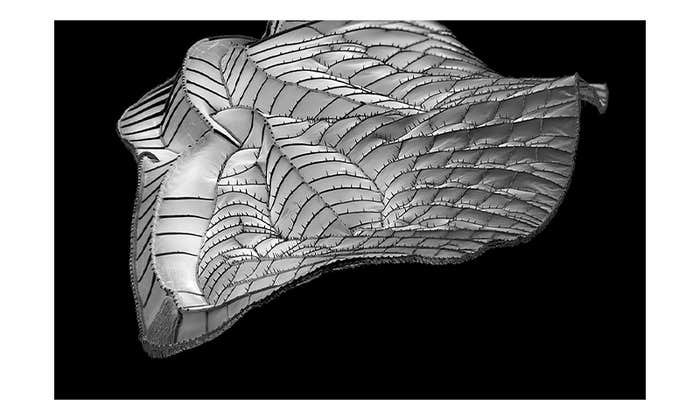
Take the photographs above. If you zoom out from the defined grey channels, Frankel says, you’d see a microfluidic device, a tool that exploits the small-scale properties of fluids, like surface tension; and if you zoom into the hedged image of the atrium, she says, “We’d start seeing the roots of the plants, and the rough edges of the stone. The more detail we have, the more we question, ‘Are there real demarcations between one [thing] and another?”
Frankel’s work has been featured in National Geographic and on the covers of Nature, Science, and other magazines. She has received grants from the Guggenheim Foundation and was an Artist-in-Residence at MIT’s Edgerton Center, “where mind and hand come together.” As Nautilus learned in a recent interview with Frankel, you can say her photographs feel like art—just don’t call her an artist.
Why do you refuse being called an artist?
The primary purpose of my imaging is to communicate information. It’s not to communicate me, or my politics, or my personal being. It’s about “the thing.” I want people to pay attention to “the thing.” I want people to feel comfortable asking questions about what they’re looking at. But at the same time, I want them to feel that the science is accessible. My pictures aren’t as intimidating as a standard science documentary picture. People aren’t afraid to ask questions about my pictures because they feel like art. They engage people.
Do boundaries have different meanings to scientists and science photographers?
Most of science happens at the interface between two materials. Chemistry, for example. When two materials come together, that’s what drives reactions, and that’s messy. In terms of design, you’d think that there’s a sharp demarcation between one thing and the other, but really, when you look closely, it’s much more complicated. The sign of a good designer is to use that transition intelligently, and make the viewer, the person experiencing the space, feel that it’s an appropriate transition.

Do most scientists agree with your approach to photography?
Not historically. But increasingly, scientists are starting to understand that there’s value in making compelling images. Of course, the astronomers have been doing this for years. One of the reasons we get so excited about astronomy is because the pictures are glorious. For example, the Hubble images are pretty spectacular, but they’ve been manipulated, colored. That’s not to say they’re wrong. We’re drawn to this amazing universe, but that’s not how it really is. I’m trying to get the rest of the disciplines to follow the astronomical community. There’s no reason why chemistry can’t be totally beautiful. Although I personally think that researchers feel that it is, which is why they go into it. I don’t think they were interested in communicating it until now.
Why are scientists now coming around to your way of thinking?
We live in an image-based society. People want pictures. The issue is that, because of the omnipresence of images, I think there’s a danger that the viewer isn’t “seeing.” We have to remember that any sort of image or drawing or illustration is a re-presentation of the thing. It is not the thing. There are decisions that have to go into making that re-presentation. A person, or an algorithm that decides how that is going to appear, or what not to include. There’s always something that’s left out.

I believe strongly that we need to have a conversation; or part of the display, the depiction, has to be some sort of description about how the picture was made. We have to create standards, not only in the making of the pictures, but in understanding what the pictures are saying—and to really be aware of image manipulation, for example. My concern is that all scientific images are clumped together in one big happy family of honest representations, and that’s not necessarily the case.
How do you think that conversation will happen?
One of my missions is to create an academic program for people like me, who have a science background or are interested in science, so that they can become part of the conversation going on in the laboratory, and then communicate it to people. That’s what I do. I’m actually having conversations with Boston University right now about a potential program. We arranged for one of the MIT faculty members to commission a BU student to create a graphic for a publication. We expect to arrange for further collaborations. Eventually, I will plan to teach a course in science photography at BU, while still holding my position at MIT.
Susie Neilson is an editorial fellow at Nautilus. Follow her on Twitter @schmeilson.


